Prompt Engineering · entry 05/07 · 3 min read
Designing for uncertainty
Products built on probabilistic systems fail or succeed at the surface — how work is reviewed, how errors surface, how much authority the model gets, and what happens when it is wrong.
The model is a component; the product is the contract
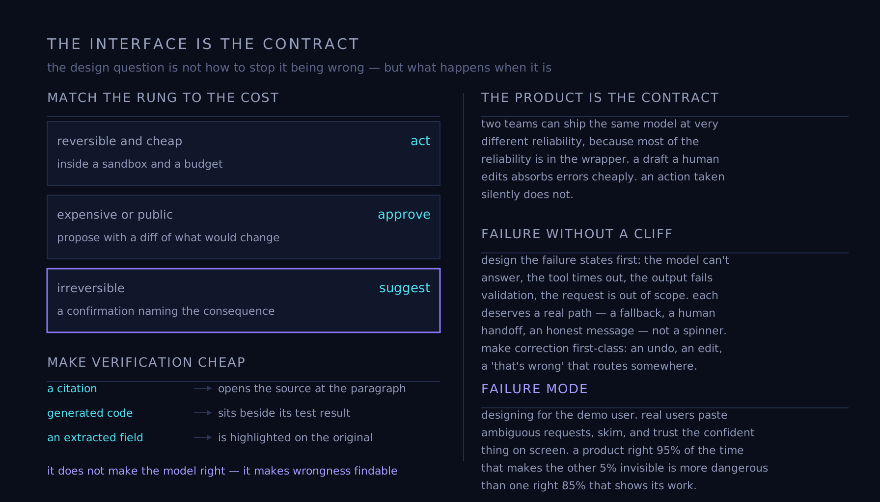
Two teams can ship the same model at very different reliability, because most of the reliability is in the wrapper. The design question is not "how do we stop it being wrong" — it will be wrong — but "what happens when it is." A draft a human edits absorbs errors cheaply. An action taken silently does not. Design and engineering shape how the accept step is drawn; where the autonomy dial sits belongs to whoever owns the consequences, set per action rather than per feature.
Match the interaction to the cost of being wrong
Reversible and cheap: let it act, inside a sandbox and a budget. Expensive or public: approve — propose, with a diff of exactly what would change, and a one-click accept, because review is only real if reviewing is easier than redoing. Irreversible: stay at suggest, or require a confirmation that names the consequence rather than a generic "are you sure." Those are the same three rungs agents use; the interface question is which rung a given action sits on and how carefully the accept step is drawn. The honest default is that the more fluent the output, the more carefully the accept step should be designed, because fluency suppresses scrutiny.
Make verification cheap, not optional
The highest-leverage UI move in an AI product is shortening the distance between a claim and its evidence: citations that open the source at the right paragraph, generated code beside its test result, an extracted field highlighted on the original document. This is the interface expression of grounding — it doesn't make the model right, it makes wrongness findable in seconds by the person who can tell. Alongside it: show uncertainty where it's measured, allow the system to say it doesn't know, and never render a low-confidence answer in the same voice as a certain one.
Failure without a cliff
Design the failure states first, because they are most of the experience: the model can't answer, the tool times out, the output fails validation, the user's request is out of scope. Each deserves a real path — a fallback, a human handoff, an honest message — rather than a spinner and a shrug. And make correction a first-class action: an undo, an edit, a "that's wrong" that actually routes somewhere. Every one of those signals is an eval case arriving free.
Failure mode
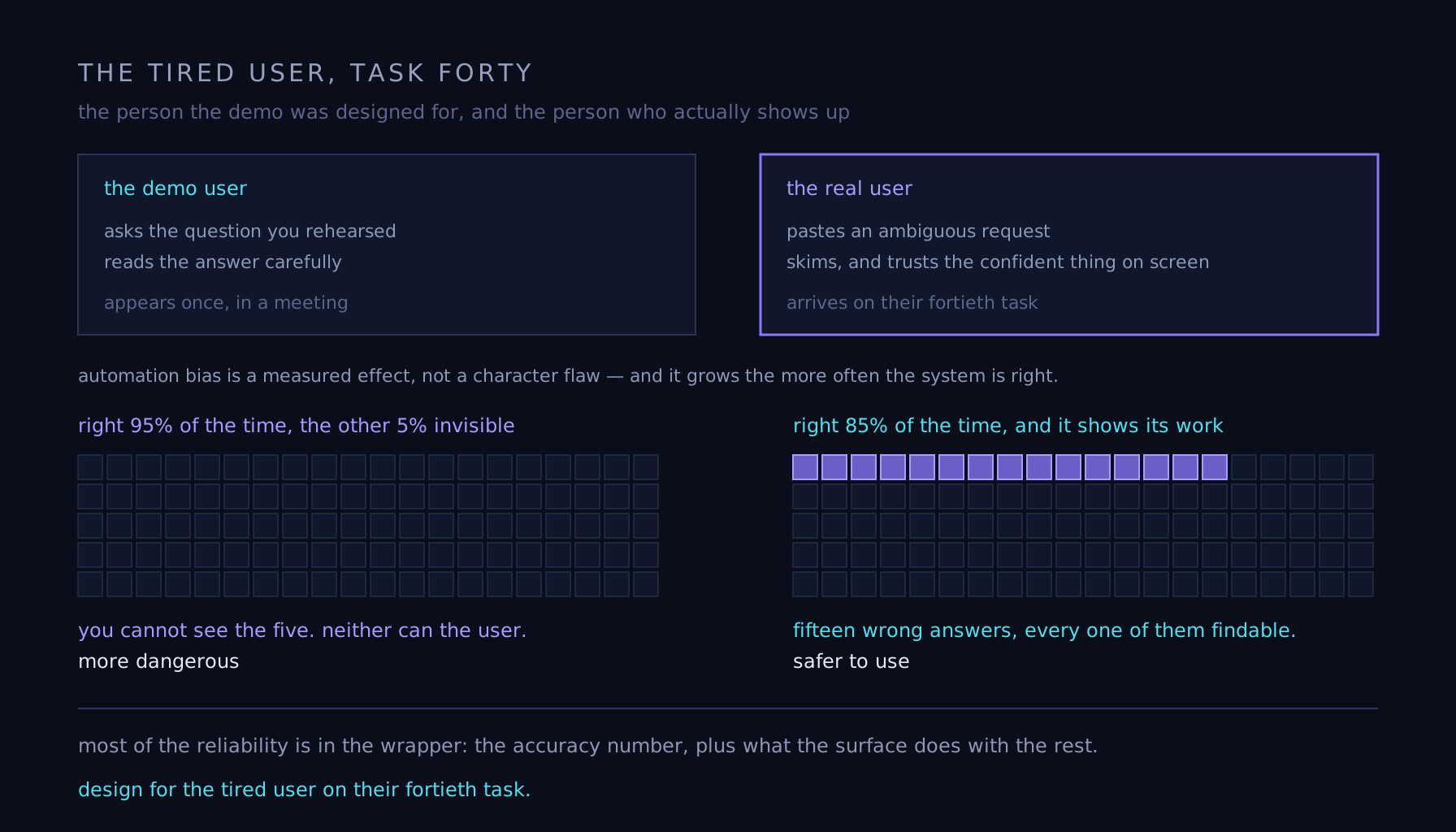
Designing for the demo user, who asks the question you rehearsed and reads the answer carefully. Real users paste ambiguous requests, skim, and trust the confident thing on screen — automation bias is a measured effect, not a character flaw, and it grows the more often the system is right. A product that is right 95% of the time and makes the other 5% invisible is more dangerous than one right 85% of the time that shows its work. Design for the tired user on their fortieth task.